


When Renzo Piano was first approached about designing an addition to the Los Angeles County Museum of Art, the Italian architect hesitated. “As I already told you,” he wrote in a letter to Eli Broad, whose donation was funding the building, “it’s very frustrating to play a good piece by a string quartet in the middle of three badly played rock concerts.”
![]()
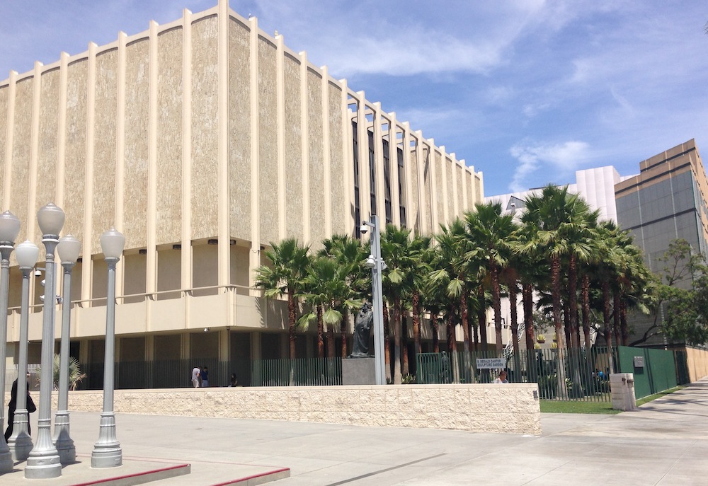
“Three rock concerts” was a reference to the existing architecture of LACMA, which had grown in fits and starts over the years. The original museum, which opened in 1965, was local architect William Pereira’s Southern Californian version of Manhattan’s Lincoln Center—three temples on a raised plaza. The second stage was a partial makeover by the New York firm Hardy Holzman Pfeiffer, which in 1986 inserted a postmodern wing and roofed over part of the plaza. The third stage (1988) was a freestanding pavilion designed by the Oklahoma maverick Bruce Goff and completed after his death by Bart Prince.
Blogger Mark Berman calls Pereira’s original buildings “mid-century classics.” Typical maybe, but classics? The architecture is pretty banal, even by Lincoln Center’s low standards. Stage two is not much better—L.A. Times art critic Christopher Knight called it “Hollywood Egyptian.” And stage three, with its two stone towers and fossil-like objects on the roof is, well, goofy by any standard.
Despite his hesitation, Piano relented and the first phase of his addition opened in 2008, the second phase two years later. The Piano addition struck me as heavy-handed, not his best work, and hardly the “good piece by a string quartet” he had promised. As for the “rock concert,” my first impression of the original museum was that it resembled an undistinguished shopping mall that had been enlarged over the years and then awkwardly converted into a cultural facility. But after sitting for a time at Ray’s and Stark Bar, the outdoor café on LACMA’s shaded plaza, I changed my mind.
Most art museums today resemble either palaces (if they are old), or upscale automobile showrooms (if they are new). This was neither. Groups of excited children played on the plaza, and clusters of teenagers wandered in off Wilshire Boulevard. The familiar mall-like atmosphere made this an unintimidating space; it was definitely not the Metropolitan Museum of Art. But it struck me that this vulgar (in the literal sense of the word) solution to an art museum succeeded in one important way. Because of its lack of pretension, this was a cheerful place in which people appeared decidedly at home.
A sense of place is an elusive quality, difficult to achieve, and not easy to maintain. It is the result not only of architectural forms but also of behavior, habit, and time. Learning to use what you have is as important as having the perfect building. That’s why it’s a shame to hear that LACMA has decided to wipe the slate clean and demolish all its older buildings, except the Goff pavilion. Why does Los Angeles, which has little enough history, feel the need to keep reinventing its surroundings?
It would be better to reconsider this wholesale demolition. Especially as the proposed replacement, designed by the Swiss architect Peter Zumthor, leaves much to be desired. It is a spreading building raised up on stilts; instead of a friendly plaza there is a dark and gloomy undercroft. The kidney shape is supposed to have something to do with the nearby La Brea Tar Pits, but it reminds me of a 1950s coffee table. Finished all in black, the proposed museum will be a somber presence among the palm trees on Wilshire Boulevard, as anomalous as a Calvinist preacher on a sunny Malibu beach. Or maybe it’s the quintessential Angeleno building? After all, replacing an aging faithful spouse with a younger more stylish trophy wife is an established Hollywood custom.
Send A Letter To the Editors