


Attached to an actuator on the shoulder of NASA’s Curiosity Rover exploring Mars right now is a set of panels that looks like an eye shadow compact. It has six pigmented silicone panels—in red, green, blue, 40-percent gray, 60-percent gray, and one in a fluorescent pigment that glows red under ultraviolet light. This is the color calibration target for Curiosity’s Mars Hand Lens Imager, a camera that takes landscape portraits and close-up shots of rocks on Mars (and also selfies). Geologists want some way to know what color these Martian rocks would be on Earth since Earth rocks are all that we’ve been able to study directly with the human eye—and color helps guide theories about a rock’s composition or history.
![]()
On Mars, and here on Earth, color matters. Without it, the red Toyota in the parking lot might be indistinguishable from the black one. You want to know if that pear in the market is juicy yellow or hard, inedible green. And let’s not even think for too long about the color of the meat in your fridge, and your assessment of whether it should be dinner, or destined for the trash. Plants and animals use color to protect themselves—a recent New York Times article described how the cuttlefish can cloak itself to near invisibility at very high speed.
Color can be subjective, but for scientists, distinctions between the colors have always been critical. They can indicate when a plant or animal is a different species or a subspecies from an otherwise identical one; in the 19th century, the use of color to differentiate species was important for what it said about evolution and how species changed over time and from region to region. Then and now, naturalists and other scientists use a visual language to identify with great precision what something actually looks like. For over a century, reference works known as color dictionaries have been the central tool used in these matters of perception and identification.
I learned about color dictionaries through my interest in bird books, which I discovered while driving Alaska’s Dalton Highway to the Arctic Ocean in 1992 with my martial arts instructor. We came to a gas station with a small, attached bookshop. I somewhat idly opened up a field guide to the birds of North America, and the heavens opened up: I realized that I could quantify and identify birds and tell them apart—birds we’d been seeing on that very trip.
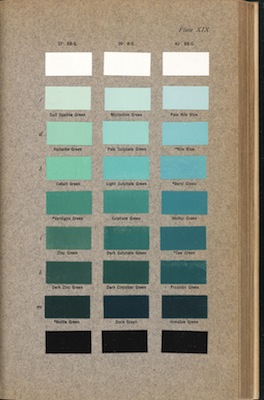
Robert Ridgway (1850–1929), Color Standards and Color Nomenclature, 1912. Copyright The Huntington Library, Art Collections, and Botanical Gardens.
I took up bird-watching as a hobby, and then, since I’m a historian, I became interested in historic figures who studied birds. Many of those figures were interested in color matters. I decided to write a biography of Robert Ridgway, who was the Smithsonian’s first curator of birds. Though obscure by the 21st century, he was one of America’s best-known scientists in the 19th and 20th centuries—a giant in the fields of taxonomics and color study. To aid in his studies, he created the most important and painstaking color dictionary, Color Standards and Color Nomenclature, which he self-published in 1912.
Ridgway’s wasn’t the first color dictionary—they initially came into use in the first third of the 19th century, around the same time that Noah Webster created the first standardized dictionaries of American words. Charles Darwin took Abraham Werner’s Nomenclature of Colours (1821)—one of the first English-language color dictionaries—on the 1831 voyage of the HMS Beagle. He used it to catalogue the flora and fauna that later inspired his theory of natural selection.
Color dictionaries were designed to give people around the world a common vocabulary to describe the colors of everything from rocks and flowers to stars, birds, and postage stamps. They afforded scientists and naturalists a means of descriptive biological precision that could be easily shared—so naturalists in Kalamazoo and Germany could communicate effectively about a family of birds found in both places in related (but different) forms. They typically consisted of a set of color swatches, each assigned a name (usually rendered in several languages, to facilitate international use), an identifying number, and an often-lyrical description of the color (“the color of the blood of a freshly killed rabbit” or “mummy brown.”)
Other important color dictionaries were published at the start of the 20th century when Ridgway published his work—some of them strange and wonderful. The French Society of Chrysanthemists, for instance, created a two-volume set of swatches and names in 1905 for their own botanical uses. Holly Green was described as “the ordinary color of the foliage of the common holly, viewed from 1 to 2 meters away, and without considering reflections.” And despite the fact that the work was meant for international consumption, its soul remained French. Sky Blue, for example, was described as “the color reminiscent of pure sky, in summer (in the climate of Paris).”
But Ridgway’s work stood out. Shy, retiring, and nerdy in the extreme, he was an astonishingly talented identifier and user of colors. This gift was key in a field where distinguishing among subspecies of birds with slight color variations was essential to understanding the mechanisms of evolution, speciation, and other scientific aspects of the natural world. Ridgway wrote a short color dictionary in 1886, just as he finished work on a groundbreaking set of rules and guidelines for naming birds. He worked quietly on his color project for decades, until 1912, when he self-published a work with 1,115 named colors: Color Standards and Color Nomenclature.
The book is filled with color swatches with names like Dragons-blood Red, which makes me think of blood dripping from a sword; or Light Paris Green, which seems like a holiday; or Light Squill Blue, which somehow sounds like a cross between “squash” and “quill” and “thrill,” though a squill is in fact a coastal Mediterranean plant.
Like many color dictionary authors, Ridgway buried within the names shout-outs to famous (or obscure) color theorists and painters. He was influenced by the work of Ogden Rood, a physicist and artist who worked up a new theory of contrasting colors. Ridgway included Rood in four color names: Rood’s Blue, Rood’s Violet, Rood’s Brown, and Rood’s Lavender. Board game maven Milton Bradley, who also sold apparatuses for mixing colors, appears in Bradley’s Blue and Bradley’s Violet. Chapman’s Blue is certainly a nod to his friend Frank Chapman, who was the first to group birds by color, rather than shape, in his 20th-century field guides.
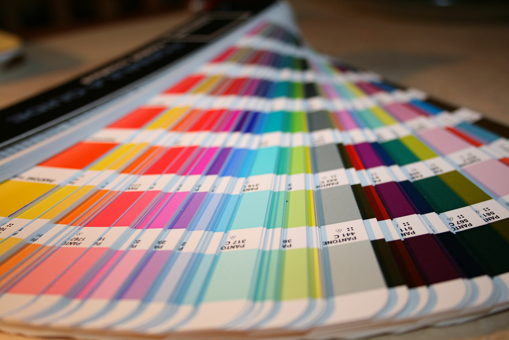
These color dictionaries have a deep, personal, and complicated history—even though they emerged from a strong desire to quantify the world, as taxonomic publications tried to do in the 19th and early 20th centuries. Colors are slippery, and they say something about the personal prejudices and interests of the namers, at least as much as they speak to the qualities of colors themselves. We don’t use them anymore because in book form they would be impossibly unwieldy: There are now more named colors than you can shake a dragon at—far more than would fit into a single volume. But Ridgway’s legacy lives on—his book evolved into the Pantone color chart relied upon by graphic designers, house paint creators, interior designers, fashion mavens, flag makers, and anyone looking to identify colors. As the Curiosity rover shows, scientists still use analog charts to identify and compare colors (as well as to discuss them by their numerically expressed wavelengths).
In fact, each year, the New Jersey-based Pantone Inc. tries to forecast the zeitgeist of the next 12 months by choosing a “Color of the Year.” The color selected for 2014 was Radiant Orchid—a purple shade described as a “complex, interesting, attracting kind of color.” Seen in sneakers and the striping of shirts, this purple was chosen because it radiated a kind of “confidence in your creativity” at a time when innovation is greatly admired. I would have preferred a more subversive, subtler, or more counterintuitive descriptor, like “Subterranean Orchid,” but I suppose colors shouldn’t sound like obscure punk rock bands. Still, unless you’re in a cranky mood, it’s hard not to smile at the name Radiant Orchid. The names are a form of public relations, really, for colors—and why not? Like babies, there really are no ugly colors. But we need to be told that sometimes, and their names are a huge part of their appeal.
Send A Letter To the Editors