


The Osher Map Library at the University of Southern Maine is a treasure trove for the cartographically inclined. Its collection, which contains close to 450,000 items, spans the centuries, covering everything from a Ptolemaic chart of the world to a record of postal routes in the Dakota Territory. For much of the past decade, the library has been working to digitize that collection, carefully photographing many items it owns and presenting them for free online. It’s an effort that speaks to the ambivalent complexities of digitization, especially for archivists and researchers. Above all else, though, it’s an opportunity for the public to look at some astonishing—and frequently beautiful—maps.
To better understand the Osher Library’s work, I spoke to Ian Fowler, the facility’s director. Fowler told me about the advanced imaging technology that the library uses, including a 60-megapixel camera used to capture especially large maps, and a new 3D camera that allows the library to render globes. “The hardest part,” Fowler told me, “is getting a 100 percent accurate digital representation of the coloring. That involves recalibrating our camera for each shot.” Accordingly, properly digitizing a single map can take half a day or more. So far, it has scanned somewhere in the neighborhood of 90 percent of its flat maps and 10 percent of the atlases in its collection.
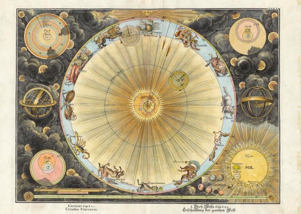
Creatio Universe, 1720.
This isn’t a purely technical endeavor—old-fashioned research still plays an important part. Once an item from the library has been scanned, catalogers carefully examine it, working to add as much metadata as possible, from basic facts about provenance and size to subtler details about notes scribbled in the margins or advertising materials on the reverse. Thanks to this work, the library has sometimes uncovered details that might have otherwise gone unnoticed, as when a cataloger working on an atlas recently discovered unusual notations such as poems that a past owner of the volume had added.
Digitization also presents scholars with a new way of looking at maps, since, according to Fowler, “you can get a lot more detail than you could even looking through a magnifying glass.” As Matthew Edney, Osher professor in the history of cartography, points out, you can also dwell on an image longer than you could while studying a physical item under controlled conditions. “Rare book rooms kick you out,” he told me, but you can take your time with digital copies.
In some cases, that’s allowed Edney to discover new features of maps that he thought he already knew well. He points in particular to an 18th-century map of New England that was once owned by Hugh Percy, a British army officer who was a key player during the battles of Lexington and Concord. “Staring at it on screen, you realize there are these faint pencil lines, possibly indicating tentative knowledge,” Edney said. As he explains in a recent paper on the topic, such observations helped him better understand how Percy likely used the map—offering a picture of what the map meant at the time, and not just what it shows.
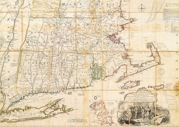
A map of the most inhabited part of New England, 1755–1768.
It’s this quality of digital maps—their ability to help us recognize the practical dimensions of cartographic texts—that may be most important for historians, since a map does much more than provide us with a sense of place. “People always assume that a map is defined by the part of the world it shows,” Edney told me. “It’s actually clear that cultural conventions, social conventions, define the nature of the map far more.” Looking at different maps from a single era can reveal competing ways of acting on and making sense of the world, much as comparing the cartography of different eras can help reveal how those ideologies and attitudes change. Digitization can make it easier to think through such issues, in part because it allows you to set archival items—which may be housed in different libraries located far apart—beside one another.
Paradoxically, however, digitization may also make it more difficult to parse the larger context of a map—or any archival object. “As soon as you turn a primary source into an image, you start to lose something,” Edney suggests. Citing the rare books scholar Michael Suarez, he points out that the first thing to go is the larger bibliographic context that comes with an object: All of those details about where it was printed and who owned it that typically accompany an entry in an archival database. Though such information ultimately accompanies a digital record, it’s easier to neglect it, thanks to the relative simplicity of access. Second (and more difficult to reconstitute on a computer screen) are the physical details of an object—its size, its smell, the grain of the paper. These are the features that can help us situate an object within its vanished lifeworld, showing us what it meant to those who made it, along with the ways it helped them make meaning from the world more generally.
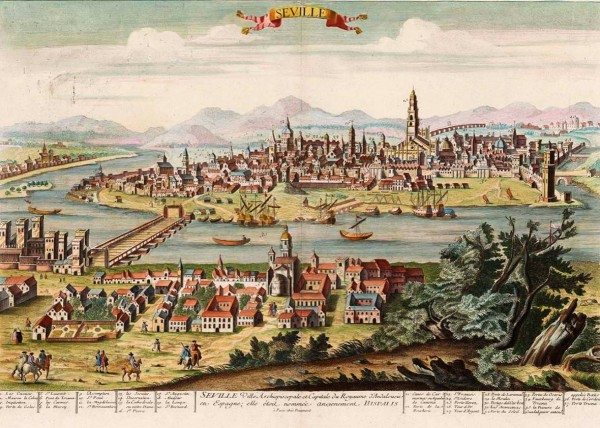
Map of Seville in Spain, 1750–1760.
The Osher library strives to frame its virtual copies of maps as fully as possible. Sometimes that means photographing beyond the edges of the image, revealing how the paper crumbles its edges or the binding of the book in which it appears. But there’s only so much they can do—especially when it comes to scale. “Online, everything looks the same size. That’s one of the things that shocks people sometimes when they come in,” Fowler told me. Though the library indicates how large an item is, researchers are still sometimes shocked when they request an item only to find that “you have to put eight tables together to unroll it.”
When all that context drops out, you’re left with the mere content of the map, which can make it harder to understand in truly historical terms. Jonathan Senchyne, director of the Center for the History of Print and Digital Culture at the University of Wisconsin-Madison (and a graduate school colleague of mine), says that this can sand down the historical texture of an object. “There’s always a temptation to think about something that’s been [digitized] in presentist terms,” Senchyne told me. In other words, it’s challenging to break free from our own ways of understanding and moving through space when we only access the past through a digital lens.
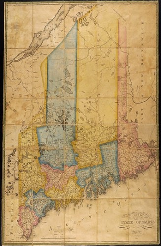
Map of the state of Maine. By Moses Greenleaf Esq. 1820.
There’s still a great deal to be found in such images, especially for those who appreciate the aesthetics of cartographic form. Look through some of the featured items on the Osher Library’s website, and you’ll come across an 1820 map of Maine, richly colored by hand; a gorgeously detailed Dutch map of the world from a century before on which shipping routes radiate out of islands like mercantile stars; a hand drawn diagram of a German river’s course; and much more. Without additional information, however, some of the other items in the collection—its 1750 manuscript land survey autographed by George Washington, for example, on which that formidable signature could easily vanish into its relatively humble surroundings—might lose some of what makes them special.
“When digitization started, a lot of people thought that would replace looking at the maps in person,” Fowler said. Today however, he and other cartographic librarians advocate studying them beside the physical ones when we can, drawing on the mutual advantages of print and digital. Those who don’t have the luxury to make their way to Portland, Maine, can still learn a great deal from the library’s collections, however, so long as they think carefully about how to approach them.
Send A Letter To the Editors