


William Snyder, a four-time Pulitzer Prize-winning photographer, is a former director of photography at the Dallas Morning News and current chair of the photojournalism program at the Rochester Institute of Technology. Recently, photographer Louie Palu interviewed Snyder about his approach to photographs both as man behind the camera and as editor behind the desk.
Q: When you were a photo editor, what were guidelines for publishing or not publishing photographs of victims of violence or war?
A: The main rule is whether it’s pertinent to the story—if it tells the story or illuminates the story—as opposed to being sensational. A good example was the fireman carrying the injured child out of the Oklahoma City bombing. There are those who either did not run that photo or buried it inside the paper. I believe that it is incredible storytelling. It brings home the violence of the situation. It puts a human face on the “numbers/facts” of the bombing. It also makes a point about who the real victims were in the bombing. The bomber said he was attacking the government but, in fact, he was attacking innocents, including the kids in the daycare center. Another example is the burning of the suspected Zulu spy by members of the African National Congress shot by Greg Marinovich. It is a horrific image but, again, brings home the violence to readers and reminds us that both sides of the battle are committing atrocities.
Q. If you published images of the dead, what made you decide to publish them?
Again: was it pertinent to the story? But, at the Dallas Morning News—as with many other papers—the farther away from the main circulation, the more apt we were to run a photo of a dead body. Distance makes it “easier” to run those photos, as the readership is less likely to know—or even identify with—the victims. A good example for us was the tragedy of the Texas A&M bonfire collapse. Short version is that A&M used to have these annual bonfires before the football season started. The bonfire was a huge event and physically huge—several stories high with large logs that were used to construct the fire. One year it collapsed, and several students were killed. We had an exclusive photo that showed a student trapped by a wall of logs. You could tell there was something very wrong with the student. We discussed whether to run the photo and where. I voted yes and argued for lead on 1A. It told the real story: this wasn’t a few logs that had fallen; it was tons of them, and they had crushed these poor students. We tracked down the student’s name and whether he was alive. He was. We ran it. He died. Lots of A&M supporters thought we were shameless. I had to answer the emails/letters, because I pushed for it.
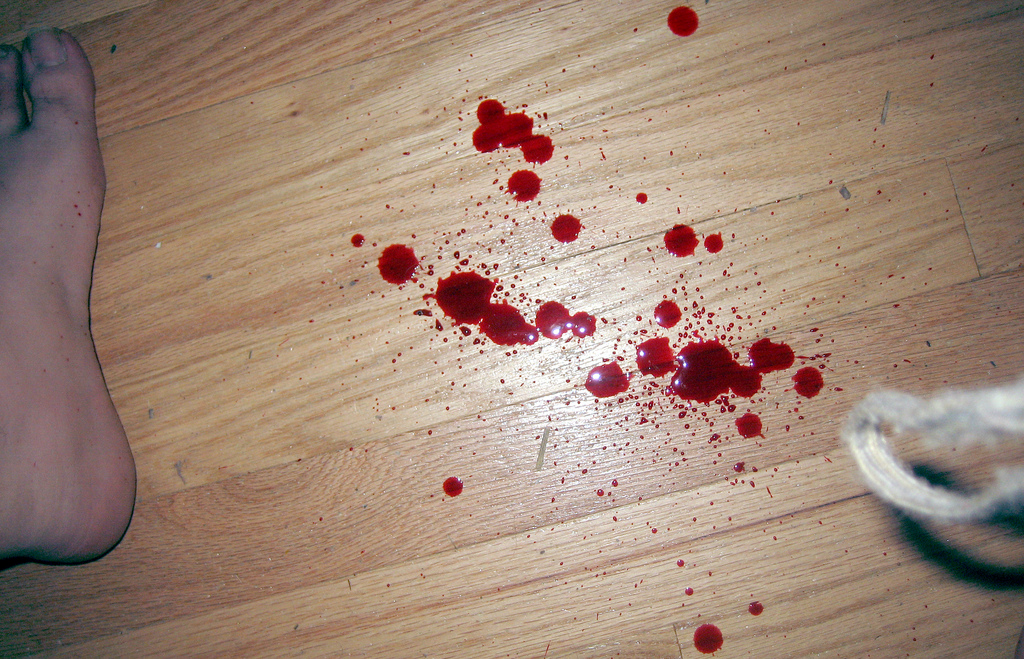
Q: Does it make a difference if photos of the dead or violent situations are published in color or black and white? Can the red color of flesh and blood increase the graphic nature of a photo, and could it be unethical to use blood as an aesthetic in a photo?
A: Yes, blood matters, as does color. There are times we would run photos inside—in black and white—to lessen their impact. I don’t think it’s unethical to use blood as an aesthetic as long as the point is storytelling. The blood splattered on the ground and boots in Chris Hondros’ photo from Tal Affar speaks volumes.
Q: Can you desensitize readers or viewers with too much violent or graphic imagery—to the point where people no longer care about an issue?
A: Absolutely, that’s one of the main reasons that the images have to be storytelling and pertinent. Otherwise, it becomes sensationalistic.
Q: What might the strategies be for a newspaper or a photo department covering such extreme violence when the images all start looking the same?
A: Well, that’s the main question for any publication: how do you keep it from becoming redundant and keep the readers interested and coming back, whether you’re talking about violent images or football? When you keep running the same types of photos over and over, people become either inured or bored. Like a photo story, you need variety. For example, Time magazine has been doing a good job with coverage from Syria, but they have to break it up from week to week. So one week they run the violence. The next they run the refugee camps, then a portrait series from the border crossing—all to tell the story in a different way, to keep the readers interested.
Send A Letter To the Editors