


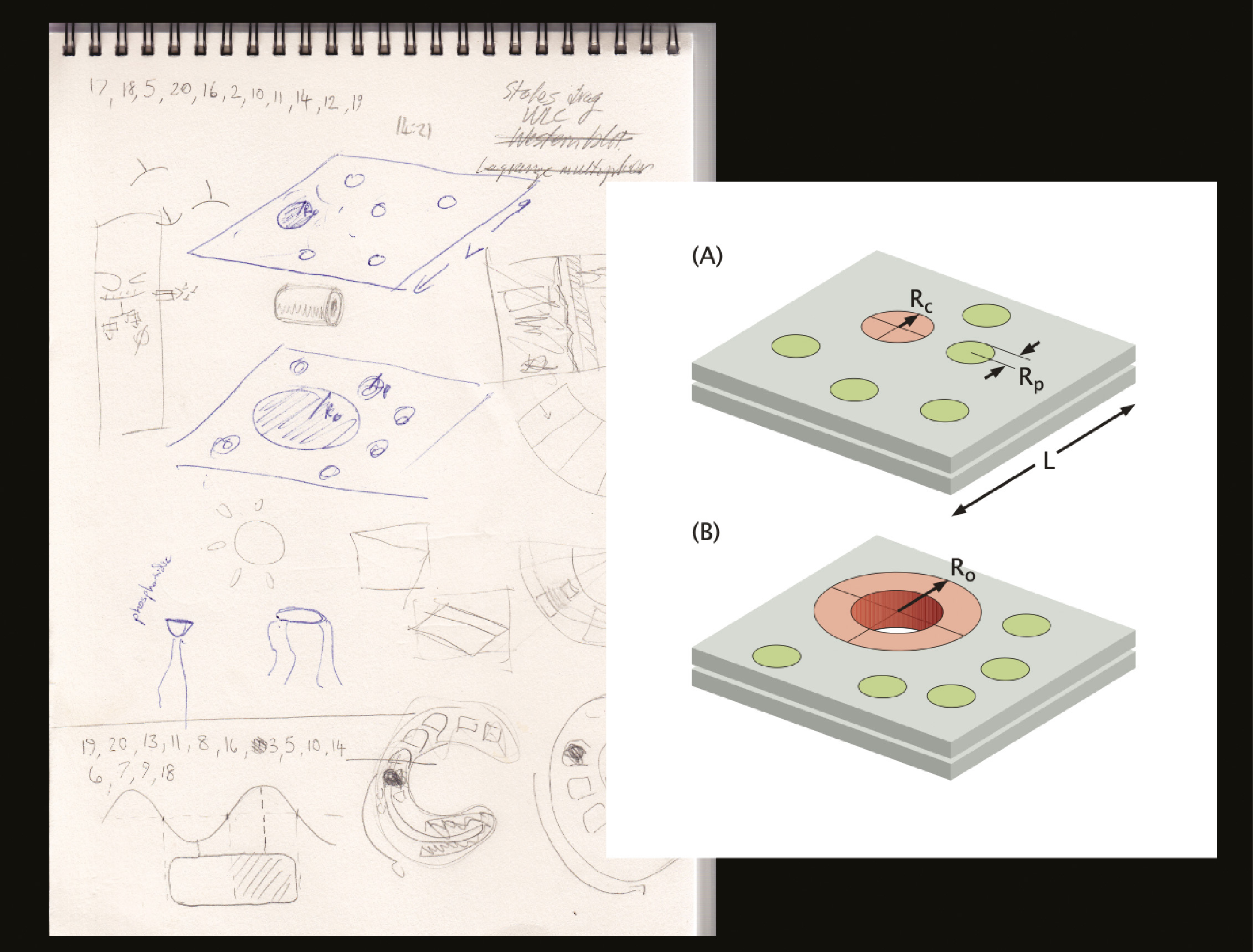
I Turn Science Into Art
My Textbook Illustrations Help Educate the Next Generation of Biologists, Doctors, and Physicists
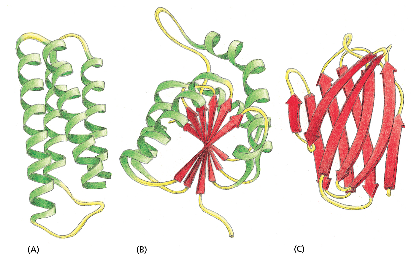
Proteins are not actually made of coils, arrows, or sheets, but Orme’s drawings of protein structures incorporate green coils (representing alpha-helices, which show how protein subunits connect in spiral formations), red arrows (representing beta-sheets, which are subunits connected in flat formations), and yellow cord (representing links between sheets and coils). Scientific illustrators employ these standard visual motifs to show the general protein structure. Reproduced from Essential Cell Biology (Fifth Edition) by Bruce Alberts, Karen Hopkin, Alexander Johnson, David Morgan, Martin Raff, Keith Roberts, and Peter Walter. Copyright © 2019 by Bruce Alberts, Dennis Bray, Karen Hopkin, Alexander Johnson, the Estate of Julian Lewis, David Morgan, Martin Raff, Nicole Marie Odie Roberts, and Peter Walter. Used with permission of the publisher, W. W. Norton & Company, Inc. All rights reserved.
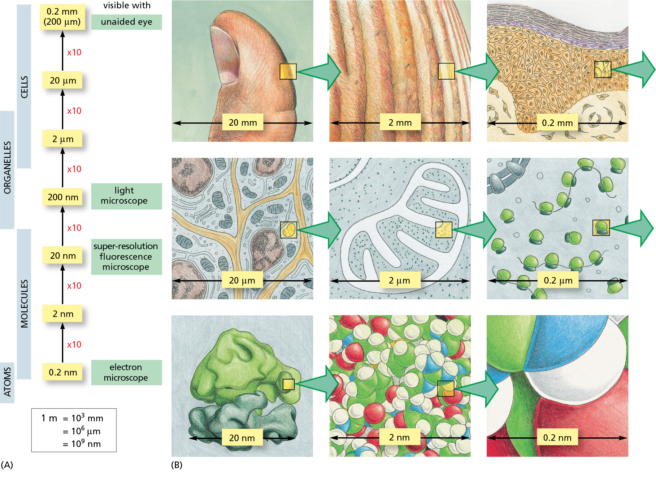
Sometimes, the best point of reference is (at) your fingertip. To help biology students comprehend microscope magnification strengths, Orme’s illustration focuses on an easily-understood object: a thumb. Reproduced from Essential Cell Biology (Fifth Edition) by Bruce Alberts, Karen Hopkin, Alexander Johnson, David Morgan, Martin Raff, Keith Roberts, and Peter Walter. Copyright © 2019 by Bruce Alberts, Dennis Bray, Karen Hopkin, Alexander Johnson, the Estate of Julian Lewis, David Morgan, Martin Raff, Nicole Marie Odie Roberts, and Peter Walter. Used with permission of the publisher, W. W. Norton & Company, Inc. All rights reserved.
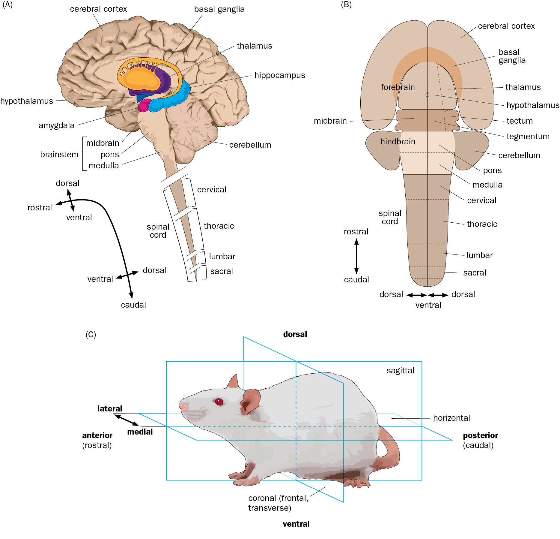
It’s easier to understand a figure when an illustrator relates it to something else. Here, seeing planes drawn through a mouse’s body helps students understand the anatomy of the human brain, above. Courtesy of Nigel Orme, from Principles of Neurobiology, Luo et. al, published by Garland Science, Taylor & Francis Group, LLC.
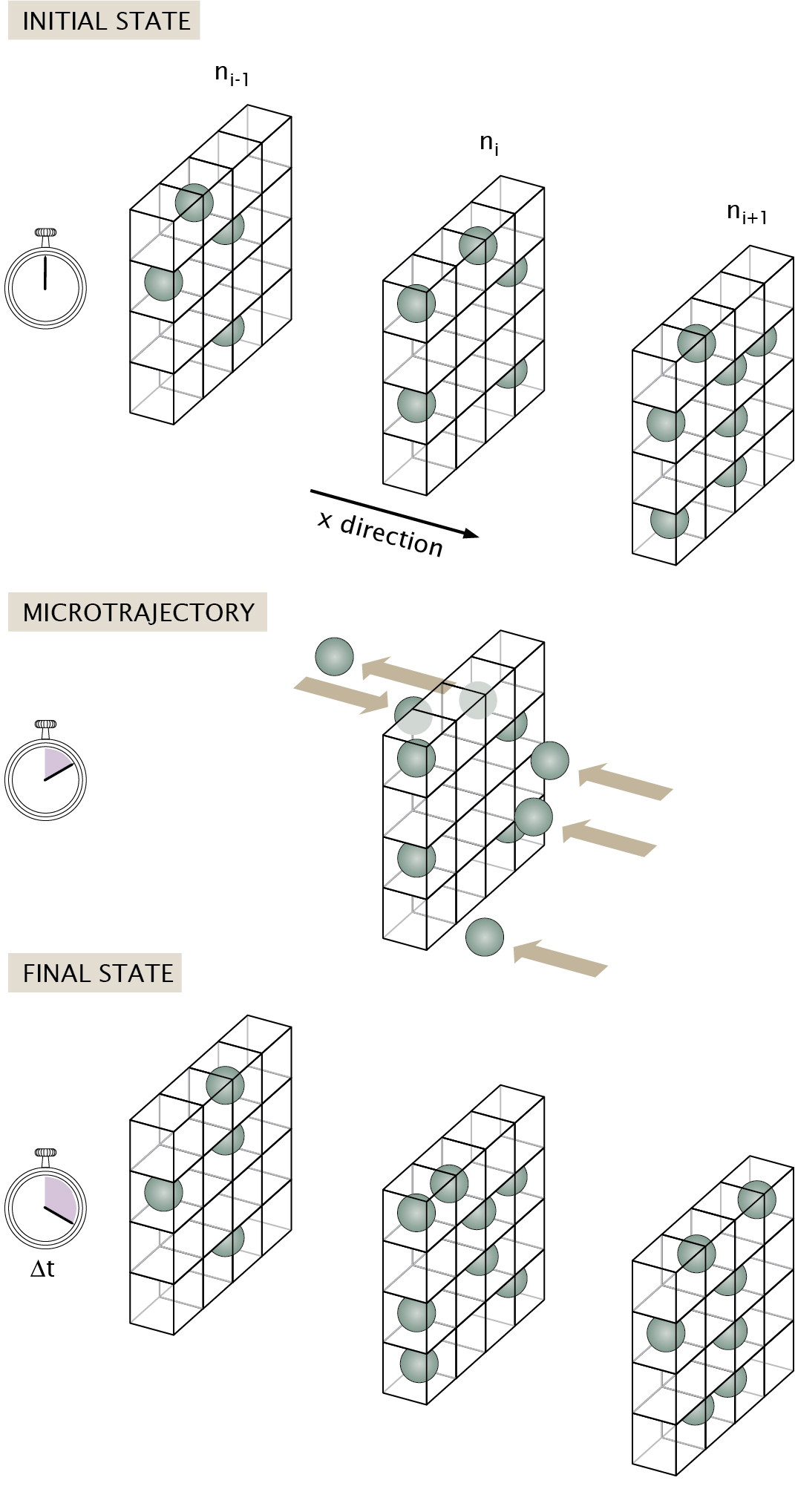
How does an artist illustrate the changes that occur as molecules pass in and out of a cell, through the cell membrane? Here, Orme represents cell membranes as “boxes” stacked into shelves, and molecules moving in and out of the shelves as “balls.” Mathematical notations describe the “boxes” at various states, over time. Courtesy of Nigel Orme, from Physical Biology of the Cell, Philips et. al, published by Garland Science, Taylor & Francis Group, LLC.
Illustrators work closely with scientists to puzzle out the best presentation for difficult concepts. Here, Orme’s sketches appear alongside an author’s attempt to explain pores in a cell membrane. The diagram that resulted from their work shows a section of a cell membrane, with open and closed pores and surrounding proteins. Courtesy of Nigel Orme, from Physical Biology of the Cell, Philips et. al, published by Garland Science, Taylor & Francis Group, LLC.

Some scientific figures are intuitive, such as this one illustrating Pavlovian conditioning in a dog. Courtesy of Nigel Orme, from Principles of Neurobiology, Luo et. al, published by Garland Science, Taylor & Francis Group, LLC.
I graduated from art school in a muddle. All I’d ever really wanted to do was draw, and I had done so on every sheet of paper that came within range of my pencil. But suddenly, it all felt very self-indulgent. I felt I should do something meaningful with my art and somehow give something back. I sincerely believe in the intellectual value of art in our culture, but I was looking for something more concrete. What could I do with my art to really make the world a better place?
Fresh out of my program, I found a job working in a government design office. One day, the manager came over to my desk with a task he thought I’d enjoy: creating an instruction leaflet for the Overseas Development Department explaining how to build a brick kiln. The leaflet was to be distributed to remote villages in West Africa to people who didn’t share a common written language, so I would have to convey information entirely through illustration and without any words. I had to include two figures, a man and a boy, who were to act as the “measuring sticks,” offering an idea of the scale of the structure. I also couldn’t employ perspective in my drawings; I was told African art mostly doesn’t use perspective, the drawing technique through which an artist makes one end of an object smaller to indicate that it is further away from the viewer. Africans looking at a drawing of a kiln that used perspective might think that one end of the kiln should be built smaller than the other.
This was an epiphany moment for me. I realized the real power of art. Here was a message that only illustration could deliver. This was my purpose!
It was just a few months later that I met Keith Roberts, a plant biologist, renowned science writer, and talented artist, who was helping a publisher create meaningful figures for several scientific book projects and was looking for an artist to ease the workload. We’ve worked together now for over 30 years. I’ve built a career as a science illustrator, helping to educate the next generation of biologists, doctors, physicists, surgeons, and more.
I should say at this point that I have no science training whatsoever. People often say to me, “Well, you must have learned so much science over that time.” The fact is that what I’ve really learned is how to ask questions of scientists. I need to understand the logic of scientific concepts so that I can visualize them and come up with narratives and figures to explain them to others. It can be a complicated process, but in the end, my scientist collaborators and I always find a common language. I’ll sit with them at the beginning of their project, or at least at the beginning of the art process, and sketch away as they talk. Generally, they are extremely patient with me, explaining over and over what it is they want me to draw until I understand the concept.
I’ve found the process to be particularly challenging when I work with physicists, whose idea of an illustration is often an equation rather than an image—but this makes physics figures some of the most rewarding projects to work on. When I worked on Physical Biology of the Cell, the physicists writing the book wanted to convey to biologists, “Look, everything you understand about biology is underpinned by physics and math. And a grasp of those subjects will enable you to maybe see your biology in a different way.” So, to make the concepts real for biologists, we had to come up with graphics that had the simplicity and clarity of typical biological illustrations, which are usually either a picture of something or a schematic diagram of an action, and then superimpose the physics and math. The process can be a revelation for the author as well as their intended audience. One of my physics friends told me that making a figure together and visualizing the math led him to understand a familiar concept from physics in a completely different way. In his mind, the visual description linked ideas that he had previously only considered separately. Neither of us could have anticipated that.
It’s remarkable to me that scientists receive absolutely no training in visual communication. Their professional reputations rest on the papers they publish and the lectures they give, and they must illustrate both with coherent figures. Yet, they are expected to somehow learn the tricks of the art trade by magic, picking up complex skills by osmosis, or by watching their perplexed peers stumbling along, trying to do the same.
When I worked with professors over the years, I often thought that I should write a course to teach science students the basics of visual communication; in 2014, with Jané Kondev, a friend and physics professor at Brandeis University and artist/educator Maddy Pikarsky, I finally did. Our week-long course includes lectures on the history of art, graphics, communication, and perception, together with practical drawing exercises, that help budding scientists look at, think about, and design clear, informative visuals. Helping students express their science more clearly and concisely, and have fun with drawing at the same time, has been incredibly rewarding.
At the start, I suffered from imposter syndrome. Sitting at a desk with some of the biggest names in science can be very daunting. But I’ve found that specialists at the top of their own professions often embrace art and become very engaged in the process of making figures. Perhaps it’s because they respect and understand the teaching power of a good illustration. Perhaps it’s because they can tell that the process of building thoughtful figures is a genuine and substantial investment in their book—not just some robotic step on a production line.
People often claim they cannot draw. The first question to ask is, “When did you last try?” (The answer is usually “in high school,” when they were obliged to.) Most people would surprise themselves if they saw how well they could draw once they practiced. If you want to be good at anything, you have to do it, do it again, and then do it some more.
Take a pocket sketchbook and a pencil and draw for five to 10 minutes every day. By the end of a month you’ll be amazed at what you are capable of. And you may just start to realize the real power of art.
Send A Letter To the Editors