


 In 2010, faculty and staff affiliated with the UC Davis Center for Regional Change, where we work, set out to build maps showing how California’s youth are doing at the community level. We wanted to enable young people to see how their communities fit into the context of opportunities in the state as a whole and advocate for themselves.
This project, called Putting Youth on the Map, reflects several interests articulated by young people and their adult allies with whom we collaborated. First was a need for a holistic measure of youth wellbeing—one that reflects the intersecting ways that young people experience education, health, social relationships, etc.—that provided information at a local level and could be viewed by ethnicity and gender.
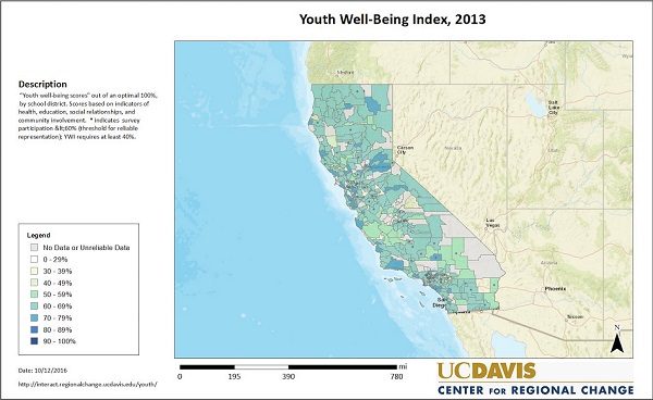
We created a Youth Well-Being Index that looked at how Californians between the ages of 10-18 fare in their communities. The index is a bit like a GPA on a school report card, combining multiple measures into an overall score out of a potential optimal 100 percent. It includes information on education outcomes, both the percentage of youth that graduate from high school, and the percentage that graduate having passed state university prerequisites. Youth health is based on scores from 9th grade tests of whether students meet minimum levels of physical fitness associated with protection against disease, and 9th and 11th grade surveys on substance use. A statewide survey called the California Healthy Kids Survey provided information on whether 9th and 11th graders experience their neighborhoods and schools as safe, report having caring relationships with adults and peers, and indicate community involvement through clubs, sports, places of worship, and/or helping others. We selected these measures based on research suggesting not only their importance unto themselves, but their tendency to indicate other aspects of wellness.
What we discovered when we looked at the whole map of California was that no community was doing very well by its youth. If most young people were meeting these education, health, social, and community involvement benchmarks—benchmarks that parents tend to want and California needs for our children—we would expect to see scores close to 100 percent (dark blue on the map). But no place even achieved an overall score of 80 percent (the equivalent of a B- on a report card). However, some places and populations, including many in the Central Valley, fare especially poorly.
Of course, youth do not grow up in a vacuum, but are influenced by their family’s access to opportunity. So we also created a Regional Opportunity Index. The Regional Opportunity Index development process, led by faculty member Chris Benner, included input from a national peer review committee of leading authorities with expertise in community development and opportunity mapping. It combines measures across the areas of economics, education, health, housing, transit, and civic engagement, drawing from multiple datasets. The index distinguishes between the resources held by individuals (the “People Index”) and available in places (the “Place Index”). For example, to assess economic opportunity, the People Index includes the percentage of people who have jobs and the percentage of people with an income over 200 percent of the federal poverty level; the Place Index includes information about job availability, job quality, job growth, and access to capital.
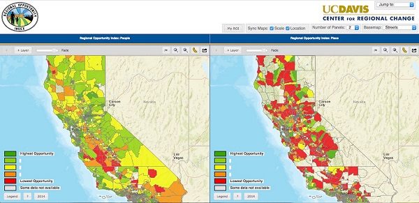
Locations depicted in green are those where individuals (on the People Index) and communities (on the Place Index) have the comparatively greatest levels of resources measured, while those in red have the least. These maps together begin to distinguish between two types of places that reflect opportunities for development. First, there are places where resources are available (green) but individuals don’t appear to benefit from them (orange/red). Secondly, there are places where resources are not available (orange/red) and people are faring poorly (orange/red). Many Central Valley communities have the latter pattern of orange/red for both People and Place.
We wanted users—youth and their supporters—to be able to interact with these data and analyses visually, so we developed point-and-click websites that share them using maps. The maps can be customized, printed, and posted to social media.
We collaborated with several California youth-focused groups to develop and pilot a curriculum and training. They focus not only on the nuts and bolts of data and maps, but why young people should care about maps at all, and how they can use them in combination with their own research and action.
The maps are tools that have helped some youth come to see themselves as activists and advocates for change. For example, we spoke with youth leaders about their neighborhood at Fathers and Families of San Joaquin, an organization dedicated to promoting the cultural, spiritual, economic, and social renewal of the most vulnerable families in Stockton and the greater San Joaquin Valley. Then they compared their personal stories to the story they found in the maps. The youth, who were all from south Stockton, looked at the index maps and said that the depressing data implicated them. One said “if the data says that we are not doing good then it must be all our fault.”
But when we showed them older maps, they saw instantly how powerful maps could be. The 1938 Stockton redlining maps used by banks for decades to deny loans to homeowners in certain parts of the city showed that the neighborhoods where the young people live today were for decades deemed “undesirable” by loan assessors. For the youth this shock turned to anger as they realized that redlined neighborhoods were those that are currently the most poverty-stricken, high crime areas. “So you mean to say that our community isn’t just the way it is, but it was built this way?” one youth asked.
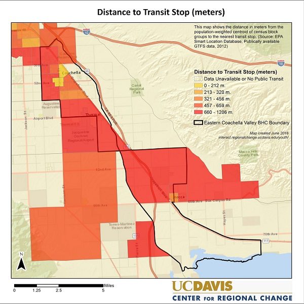
The maps can also help young people figure out what their community needs. For example, through collaboration with diversity advocates New America Media, young people used maps to support their own investigative research. Youth working for Coachella Unincorporated, a publication in the eastern Coachella Valley, drew upon both their own experiences and maps to highlight the long distances between where people live and major transit stops and to encourage investment in additional transit stops as well as sidewalks and walking paths to access them.
In Sacramento, youth used maps to bring community challenges to life in planning for a major gathering, the Sacramento My Brother’s Keeper Summit in 2015. Ten young people were brought together to help create the summit program. After reviewing maps of their city, the youth focused on three key areas: safety, education, and employment. They then developed and recorded skits focused on their lived experience of the analyses.
One skit complemented data on the percentage of youth who are neither in school nor working, and spoke to the need for youth to feel like they are contributing by way of employment. The skit starts with a young man talking to himself about wanting to stop hustling and get a real job. He relives his experience of selling drugs as a way to make money and the impacts that has on him and his community. The video then moves to the young man walking in to local businesses and asking if they are hiring, only to be refused because of his age and then ridiculed about how he is dressed. The video ends up with the grim reality many youth face when they are not in school or working; they end up getting looped back into the juvenile justice system. The maps and skits together communicated youth experiences and needs to the intergenerational audience of youth participants and adult allies in a powerful way.
Even the best quantitative data maps can only tell a very partial story about young people’s lives. However, integrating these analyses with youths’ real-life experiences helps to start the intergenerational discussion, planning, investment, and action we need to strengthen Central Valley communities and redraw these maps.
Send A Letter To the Editors